The best way to add a background image is via CSS. You can use the CSS “background-image” property to add a background image to an element. This property looks like this:
background-image : url(image-url);
“image-url” refers to the absolute or relative url of the image. For instance, you could write the property as follows:
background-image : url(../mypics/bgimage.jpg);
or
background-image : url(http://www.yourwebsite.com/mypics/bgimage.jpg);
The background-image property has to be part of a CSS rule.
For instance, the background image for a textarea can be added using the following rule:
textarea
{
  background-image: url(images/sun-set.jpg);
}
Similarly you can use a CSS id selector, a class selector or even a pseudo-class. In fact, you can use any valid CSS selector. For instance, the image below is a background image of a <div> with an id of image_bg as follows:
<div id="image_bg">
Div Content
</div>
#image_bg
{
  width: 240px;
  height: 150px;
  background-image: url(images/sun-set-small.jpg);
}
Yet another alternative is to use inline style in the HTML tag or element
<div style="background-image: url(images/sun-set-small.jpg);">
Div Content
</div>
Index
- Background Image Quick Reference
- Set the background image of the entire page
- Background Image Repeat
- Background Image Positioning
- Background Image Resizing
- CSS Background attribute Combined
CSS Background Quick Reference
In addition to the background-image URL, there are a number of properties that you can use to customise the display of the background image.
Here is a quick reference to CSS Background properties:
background-imageThe url of the background image Example:
background-image: url("gradient.png");
|
background-repeatWhether to repeat the background image. Examples:
    background-repeat: repeat;

    background-repeat: no-repeat;

    background-repeat: repeat-x;

    background-repeat: repeat-y;
the default is repeat |
background-attachmentWhether the background should scroll along with the content Examples:
        background-attachment: scroll;
        //The background scrolls along with the content

        background-attachment: fixed;
        //The background is fixed and the content scrolls
default is scroll |
background-positionThe position of the background image Examples:
            background-position: top left;

            background-position: top center;

            background-position: 20% 30%;

            background-position: 20px 30px;

            background-position: center;
default is top left |
background-sizeThe size of the background image Examples:
            background-size: 120px 200px;
            //exact size

            background-size: 120px auto;
            //automatically calculate the height

            background-size: auto;

            background-size: cover;
            //The background image must cover the entire area
            // (parts of the background image may not be seen)

            background-size: contain;
            //The background image is fit within the container element
            // without losing aspect ratio

            background-size: 30%;
            //background image covers only 30% of the containing element
default is auto |
background-color The background color value. Examples:background-color:transparent; background-color:blue; background-color: #00ff00; background-color: rgb(10,200,10); |
Set the background image of the entire page
Here is a sample page where we are setting the background image of the entire page
<!doctype html>
<html>
    <head>
        <meta charset="utf-8">
        <meta http-equiv="x-ua-compatible" content="ie=edge">

        <meta name="viewport"
         content="width=device-width, initial-scale=1">
    <style>
    html{
          background-image: url(sunset-sunrise-city-water-7629.jpg);
          background-repeat:no-repeat;
          background-position:top left;
        }
    </style>
    </head>
    <body>
        <h1>Your Heading</h1>
    </body>
</html>
This bit of CSS code sets the background image of the HTML Page.
html{
  background-image: url(sunset-sunrise-city-water-7629.jpg);
  background-repeat:no-repeat;
  background-position:top left;
}
You can see the demo here
22934
The background-image property points to the URL of the image.
background-repeat is set to no-repeat so that the browser won’t tile the background image. The default is to tile the background image. The other values for background-repeat are ‘repeat’, ‘repeat-x’ and ‘repeat-y’.
The background-position property is to set the position of the background image. You can set the position to center center to center the image in the page
Background Image Repeat
By default, the background image is tiled so that it fills the entire area of the element.
For example, take a look at this:

This is
div.my-div
{
    background-image: url(images/orchids.jpg);
    background-repeat: repeat;
}
‘repeat’ is also the default.
To avoid the above image from repeating, we’d simply write:
div.my-div
{
background-image: url(images/orchids.jpg);
background-repeat : no-repeat;
}
With this, the above <div> would look like this:

The background-repeat property takes one of four values i.e. no-repeat, repeat, repeat-x, and repeat-y. Here is a brief explanation of these values.
no-repeat:
turns off background repetition. The image displays only once. You’ve just seen this in the <div> above.
repeat:
this is the default. It repeats the image until the entire background is covered.
repeat-x: this repeats the image along the x-axis. The x-axis runs from left to right. For our <div>, if we change its property to “background-repeat: repeat-x;”, it displays like this:

div.my-div
{
background-image: url(images/orchids.jpg);
background-repeat : repeat-x;
}
repeat-y:
this repeats the image along the y-axis. The y-axis runs from top to bottom. For our <div>, if we change its property to “background-repeat: repeat-y;”, it displays like this:

div.my-div
{
background-image: url(images/orchids.jpg);
background-repeat : repeat-y;
}
Background Image Positioning
When you insert a background image, it is automatically positioned on the top-left corner of the element.
However, you can control the position in which the background image is displayed. You can do this using the background-position property.
The CSS background-position property takes three kinds of values: keywords, precise values and percentages. Let’s look at each of them:
Keyword Values
These values use specific keywords to determine the position of the image. There are two sets of keywords which are used in combination. The first set determines the horizontal position of the image. They are “left”, “center” and “right”. The second set determines the vertical position of the image. They are “top”, “center” and “bottom”.
A typical keyword-based background-position value takes the form of something like “top left”, “bottom right” or “center center”.

In order to position an image in the bottom-right, for instance, write: background-position: bottom right; and it will display like this:

div.my-div
{
background-image: url(images/orchids.jpg);
background-repeat : no-repeat;
background-position: bottom right;
}
The order in which you write the horizontal and vertical positions doesn’t matter. You can as well write: background-image: right bottom;. Its effect will be the same. That goes for all the other keyword values too.
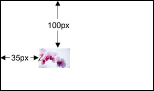
Exact Values
You can position a background image by setting its vertical and horizontal positions. The positions can be set in either ems or pixels. This looks something like this:
background-position: 35px 100px;
OR
background-position: 10em 3em;
This is interpreted as follows:
The first value (i.e. 35px or 10em) is the horizontal position of the image. It is the distance between the left-edge of the image, and the left-edge of the element.
The second value (i.e. 100px or 3em) is the vertical position of the image. It is the distance between the top-edge of the image, and the top-edge of the element.
See below:
Background image position – percentages
You can use percentages for position as well. For instance, you can have a rule like this:
background-position: 10% 25%;
The first percentage is the horizontal position, and the second percentage is the vertical position.
The difference from using exact values is that the position of the background image changes as the containing element resizes. For example, if the containing element is set to fit in to the browser window, the background image position also changes as the element resizes.
Mixing position values
You can actually mix em, pixel and percentage values. For instance, the rules below are valid:
background-image: 5px 3em;

background-image: 4px 10%;

background-image: 7em 45%;
Background Image Resizing
When you apply a background image to an element, it is usually displayed according to its original size. If it is much larger than the element, only part of it will be displayed. If it is smaller, it will be tiled (unless you turn off its background-repeat property).
The “background-size” is used for controlling the display size of a background image. It takes two kinds of values i.e. width-height values and auto-scaling values.
Width-Height Values
These enable you to resize a background image by setting its display width and height. They take two sets of values which can be in pixels, ems, percentages or the keyword “auto”.
A note on aspect ratio
When you resize an image one important thing to remember is the aspect ratio. If we don’t maintain the ratio between the height and width, the image will look weird. For example, if the original image is 100px by 200px and if you are resizing it to 50px by 50px, the resulting display will look skewed.
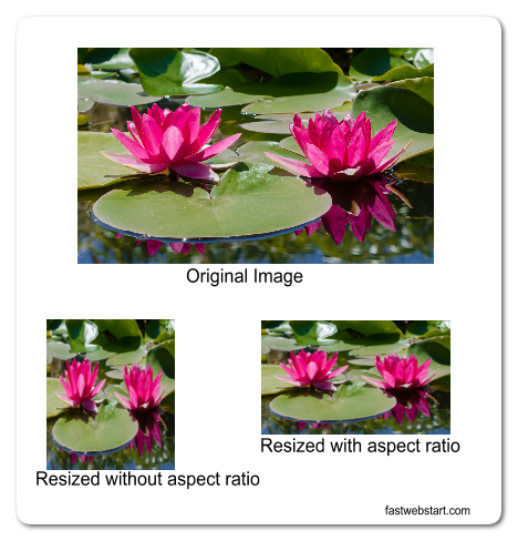
When you give the background image size, you can provide one of the sizes (vertical or horizontal ) and leave the other to be “auto”. This will make the browser calculate the other size maintaining the aspect ratio.
For example:
background-size: 150px auto;
this will cause the width to be fixed at 150px and the height being calculated based on the aspect ratio.
Fitting the background image within the element
Suppose you want to fit the image within the element no matter the image size, You can use one of these background-size options.
Unlike the width-height, these values automatically adjust the image to fit into the element. There are two auto-resize values: “contain” and “cover”. They are used as follows:

background-size: contain
The background image is resized to fit within the element such that the whole image is inside the element – maintaining the aspect ratio.
background-size: cover
This tells the browser to cover the entire element even if it requires stretching or cutting part of the image.

CSS background attribute combined
Writing each of the properties (e.g. background-image, background-position, etc) can get repetitive and clunky. Fortunately, there is a short-cut. This takes the following form:
background: url position repetition attachment color;
where
- url – is the value of “background-image”
- position – is the value of “background-position”
- repetition – is the value of “background-repeat”
- attachment – is the value of “background-attachment”
- color – is the value of “background-color”
Take this div, for instance:
#data-box{
	background-image : url(data-bg.jpg);
	background-position: center right;
	background-repeat: no-repeat;
	background-attachment: fixed;
	background-color: #CF23A5;
}
You can write this as follows:
#data-box{
	background : url(data-bg.jpg) center right no-repeat fixed #CF23A5;
}
